Gazprom neft RU
Petrol Forecourts
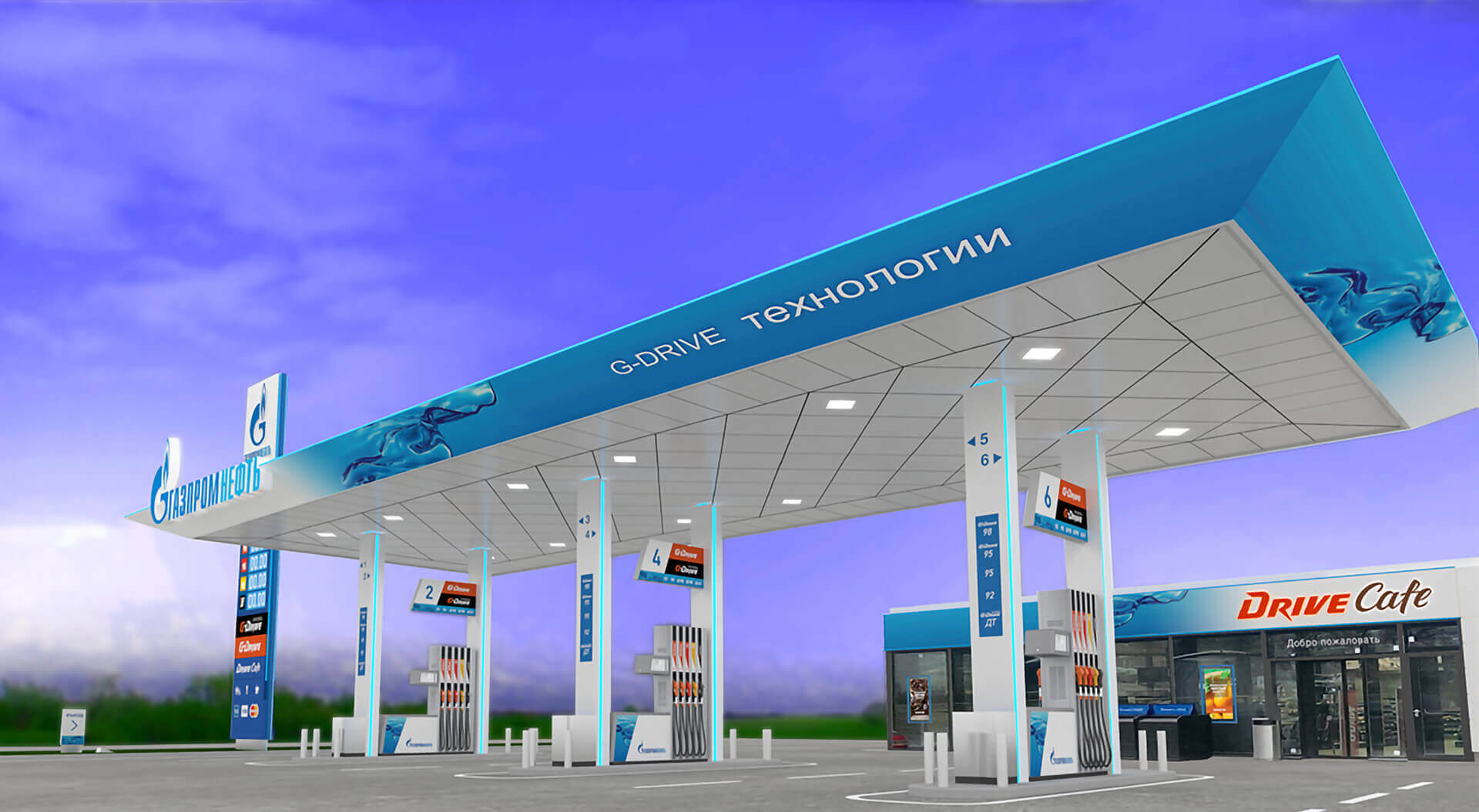
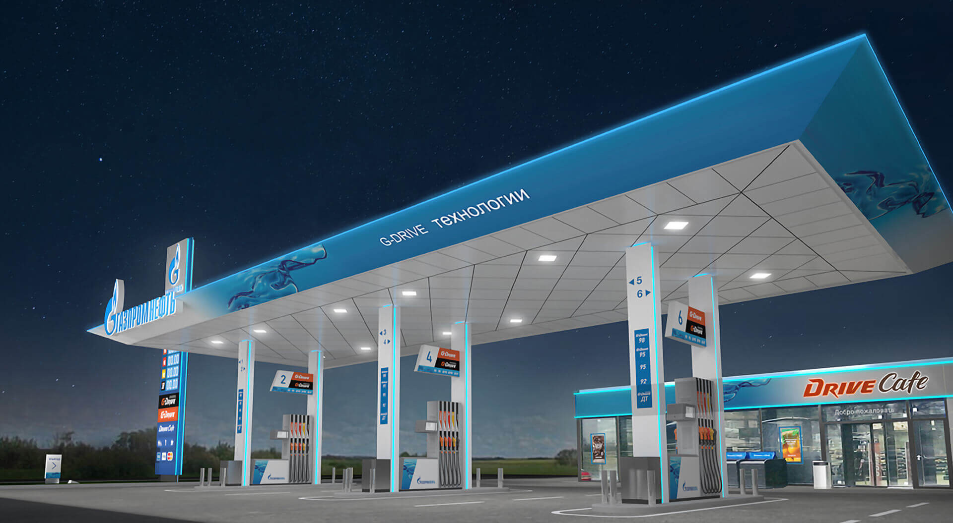
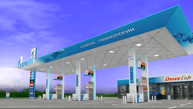
A new concept for Russia’s best petrol filling station rebrand and canopy design.

Gazprom Neft wanted to be seen as a confident brand, a challenger to it's larger rival Rosneft and reflect a shift to a modern, "cleaner fuel" retail operation.
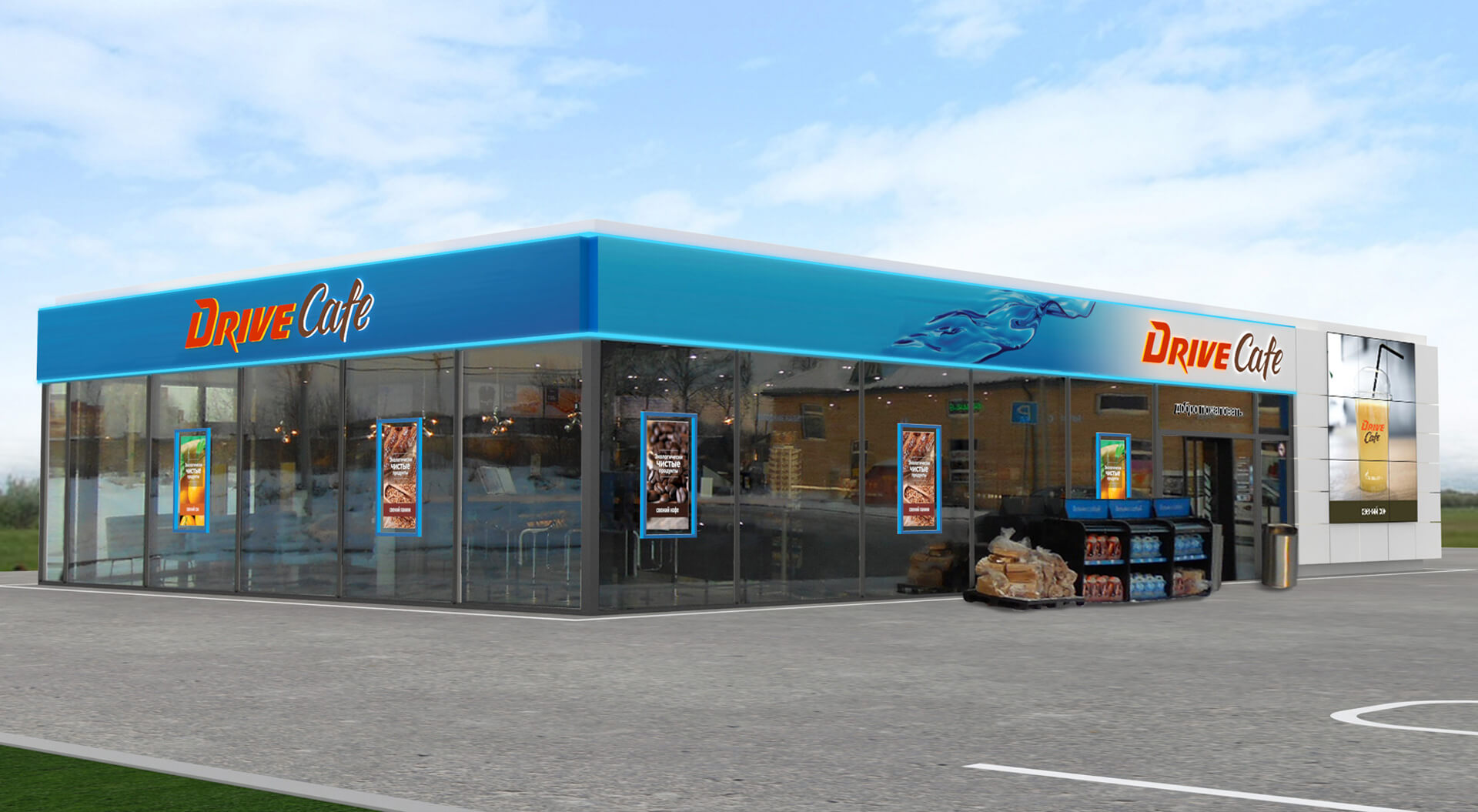
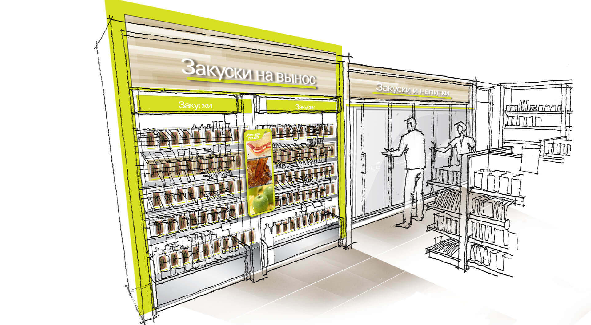
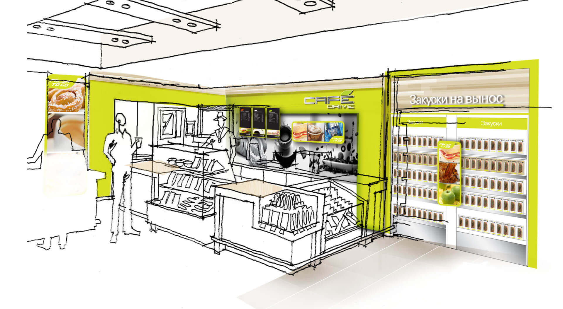
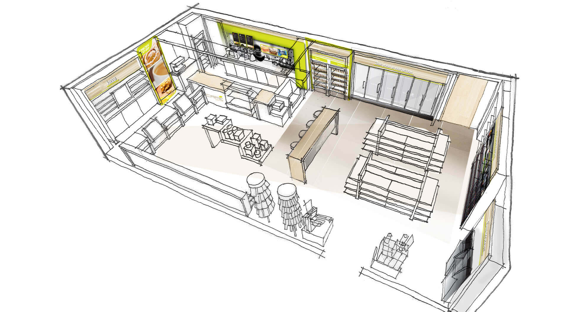
The design solution provides a contemporary vision for the brand platform and retail operation.
Location - Moscow, Russia.
The Gazprom Neft brief asked for consideration of the following:
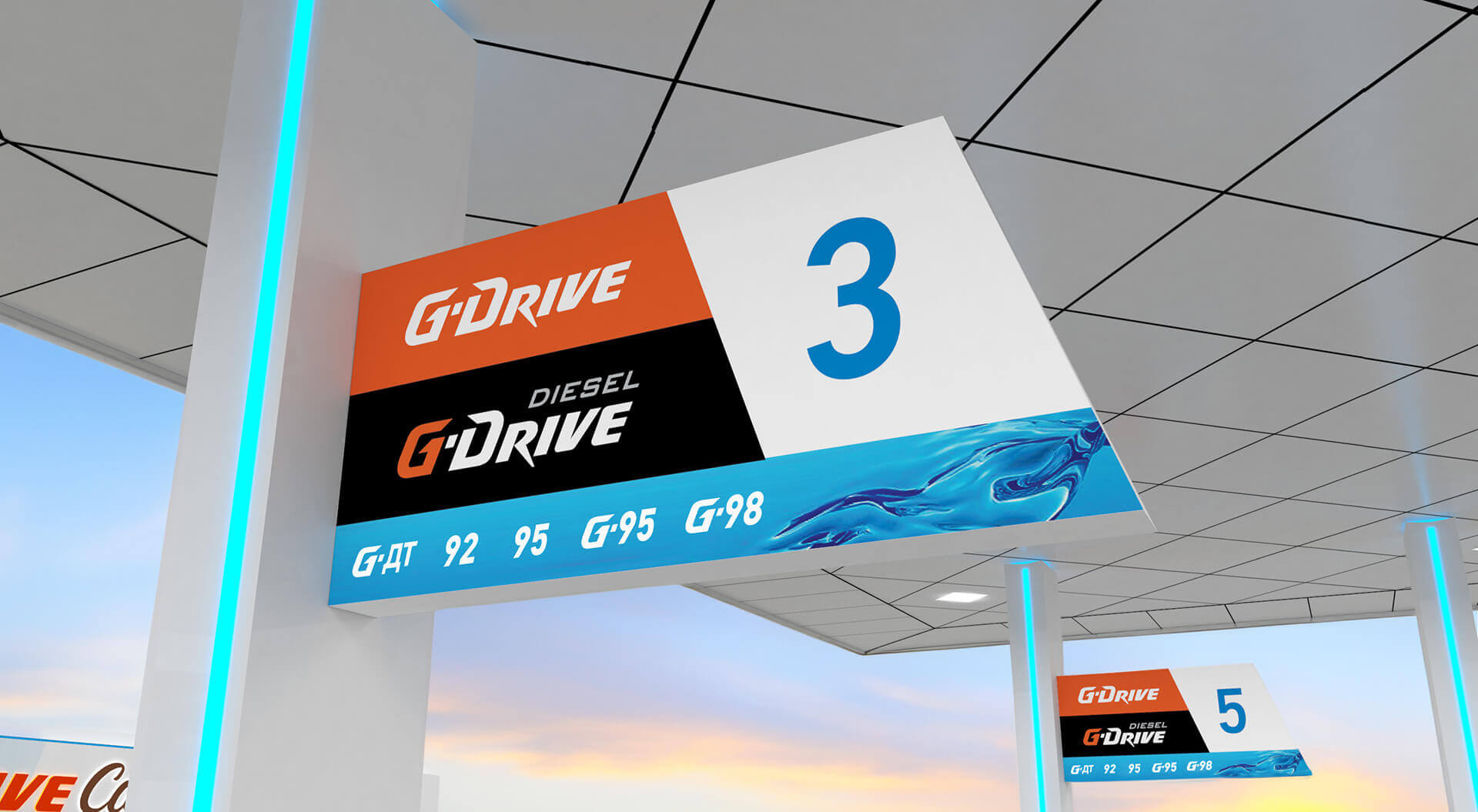
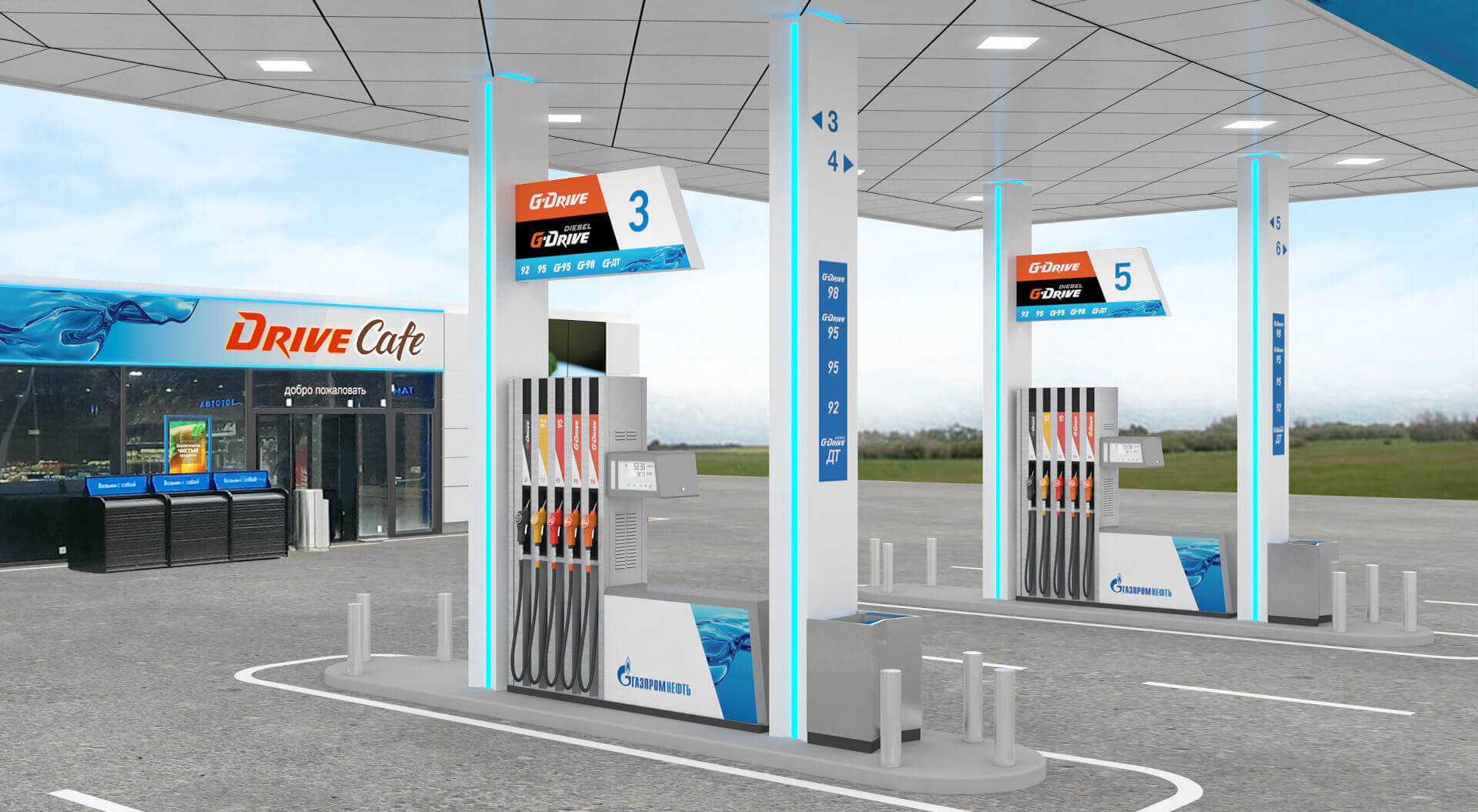
That the master brand and basic retail brand colour of the Gazprom Neft gas stations network, and the existing retail sub-brands (G-Drive, G-Drive Diesel and Drive-Cafe) remain unchanged, and the existing general plan of the gas station in Super L format remain the same and finally to provide a vision for a future brand platform.
Our solution embraced the following values:
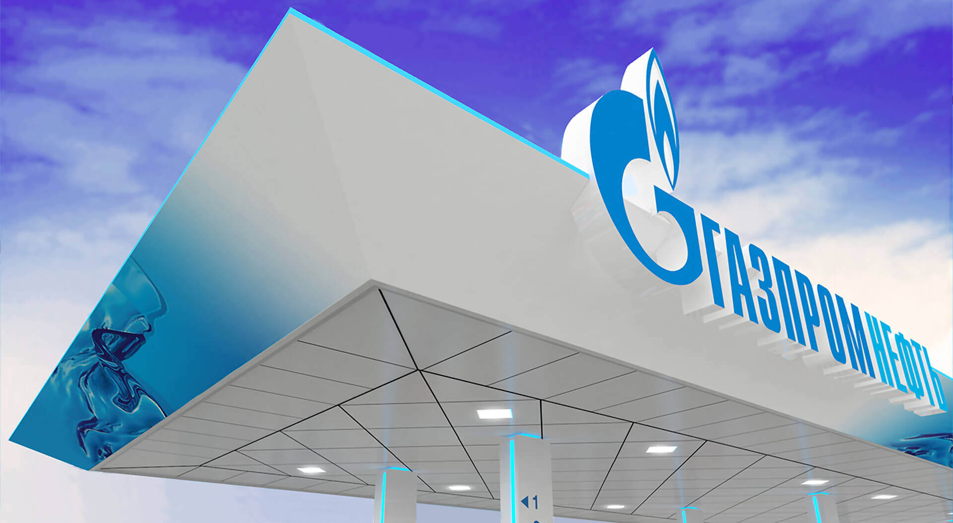
Synergy and fusion services, reliability, trust, care for the customer, energy through movement. Linking today with tomorrow, a leap into the future. The organic shape of the canopy reflects the reliability and flexibility of the brand. The transparent layers blending together represent the fusion of products and services.
The semiotic message of the fusion canopy form and super graphic image aims to engage customers with the Gazprom Neft brand. The dialogue between the counterparts produces a sense of transparency and movement, as well as confirming the corporation’s dynamic outward-looking vision for the future. ”Rest here and refresh this is your motorway fusion hub” (a place of comfort and service).
